Choosing Colors for Your Therapy Office Color Palette
Choosing Colors for Your Therapy Office Color Palette
What are the best colors for a therapy office?
Interior designers and decorators consider the impact of color on our moods when designing rooms. Most agree that colors easily found in nature, like blues, greens, and browns, are great options for creating a calm space. This is a great starting point for therapists. However, if you’re like many of the therapists I design offices for, you’re wanting a little more direction. Here are some of my top tips for selecting therapy office colors.
Inspiration Piece
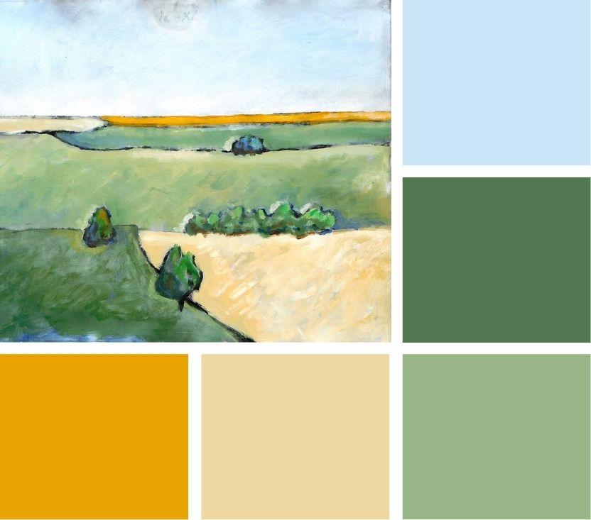
As discussed in my How to Decorate A Therapy Office: The Step-by-Step Guide, starting with an inspiration piece is a great way to select your office colors. This could be a piece of art or decor you already own or something new you plan to buy for the space. Notice the details of this piece: what are the main colors and approximately how much of each color is included? You’ll find that many decorative pieces use one to two main colors and then a few others as accent colors.
Closet Color Inspiration
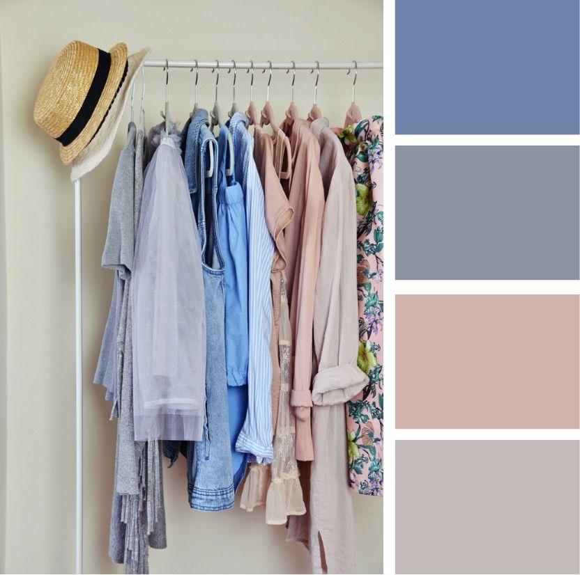
Here’s another tip from the interior design world: If you’re struggling to find an inspiration piece, take a tour through your wardrobe – what colors do you wear most often? What colors do you gravitate towards when pulling together an outfit? Those can be a good starting point for colors you know you’ll feel good in.
How many colors should I use?
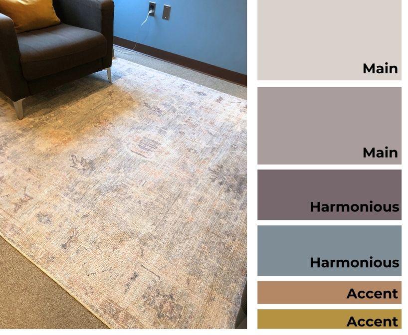
I recommend using between 3-6 colors in your therapy office. When I design a therapy office, I usually end up choosing:
- Two main colors (this can include neutrals like cream, gray, brown, or cognac).
- One or two harmonious colors (i.e. colors that complement the main colors and/or are next to the main colors on the color wheel; these can also be neutrals)
- One or two accent colors (i.e. contrasting colors that are opposite the main colors on the color wheel).
Applying the 60/30/10 Rule for Color
The 60/30/10 rule is a common rule of thumb in the design world. It’s used to help create a balanced and harmonious color scheme. Here’s how it breaks down:
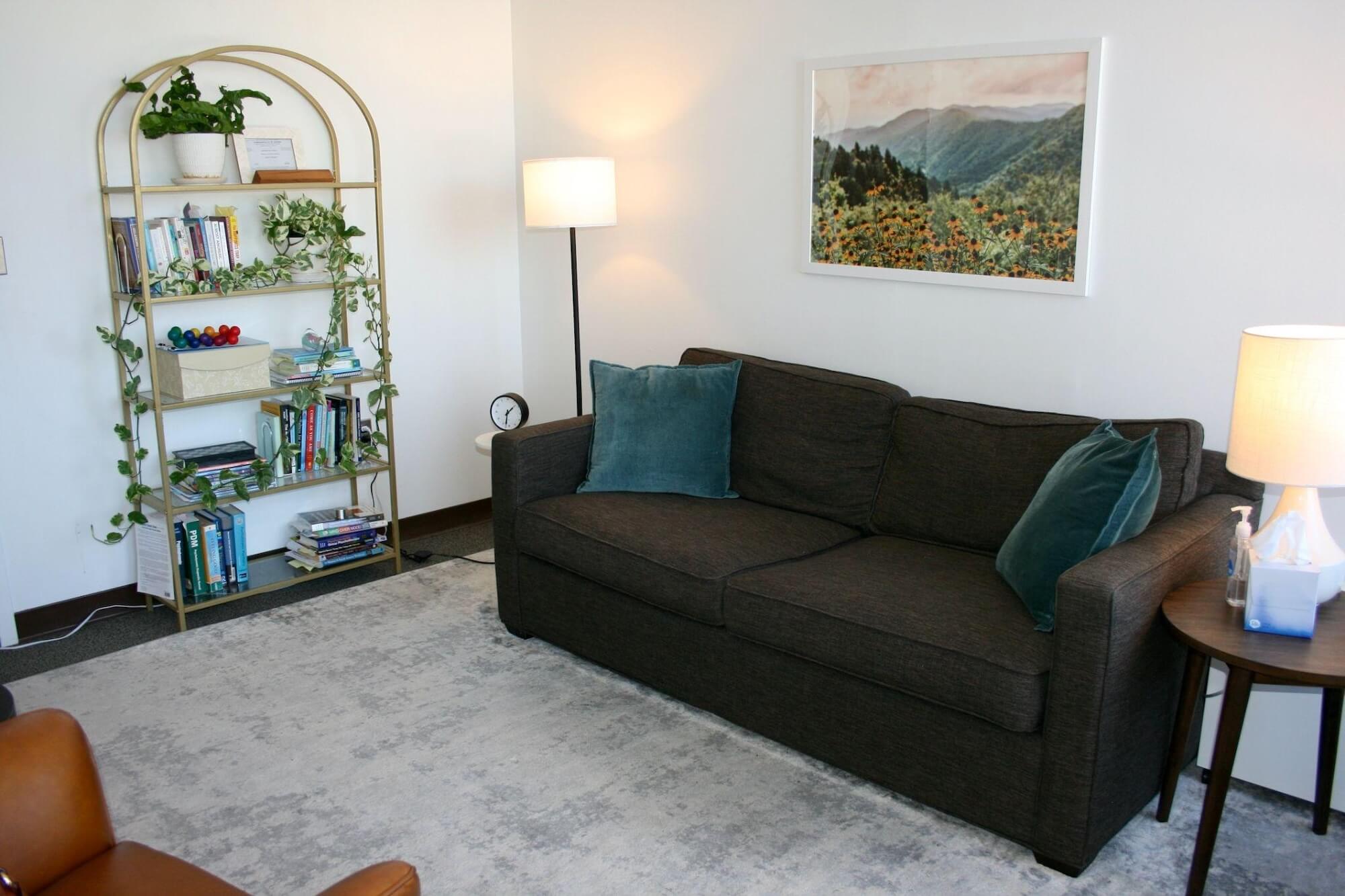
- 60% Dominant Color: Use one or two main colors for the largest elements in the room, such as walls or large furniture pieces. This forms the foundation of your color scheme.
- 30% Secondary Colors: Incorporate harmonious, complementary colors through items like rugs, artwork, or smaller furniture. These colors support and enhance the dominant hues.
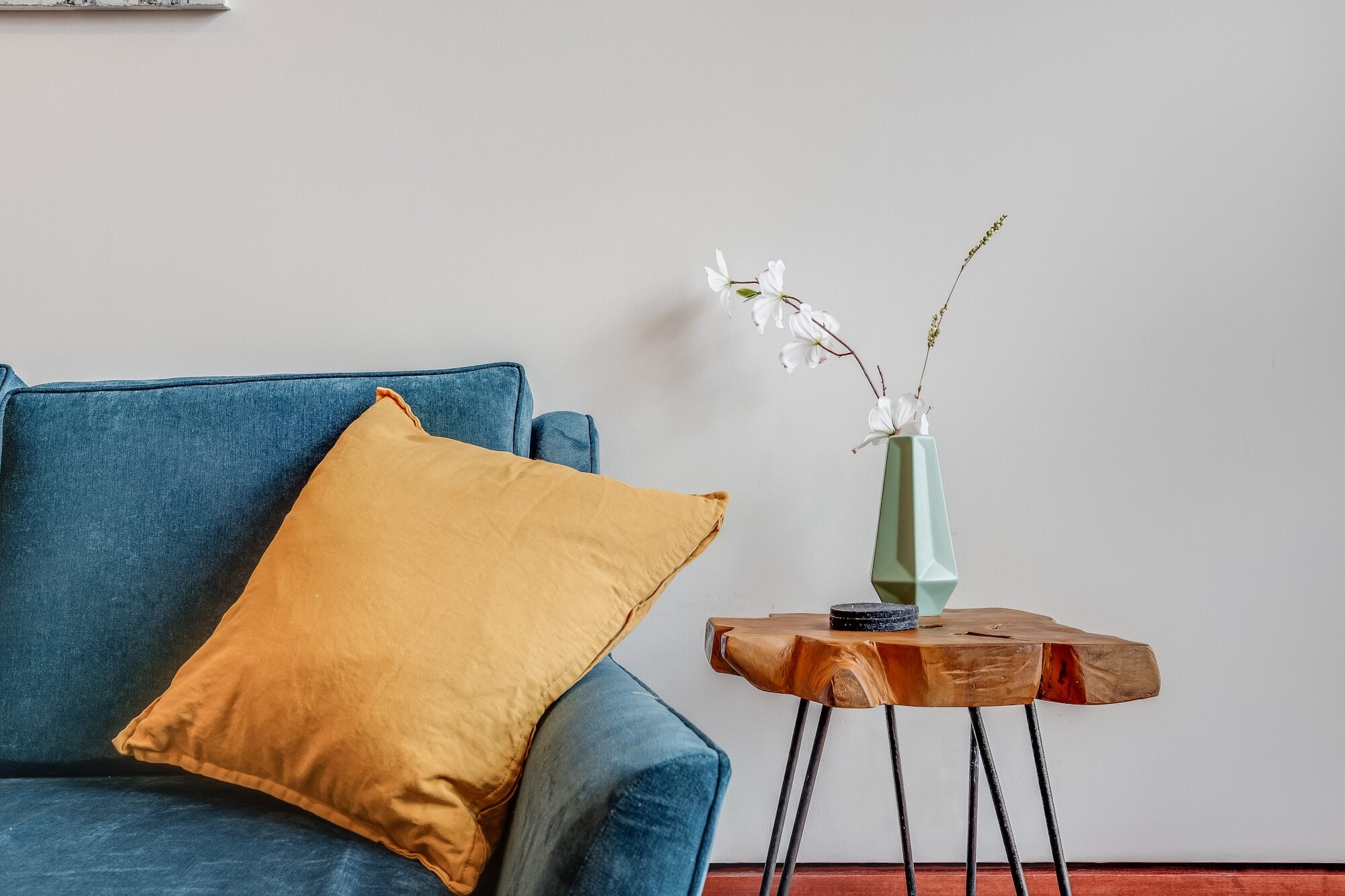
- 10% Accent Colors: Add one or two accent colors through details such as pillows, small artwork elements, lamps, and other minor accessories. These provide pops of color and visual interest.
The goal is to introduce color in an intentional and cohesive way. Picking too many colors, or adding the same amount of each color, can overwhelm a space. Instead, we want some colors to stand out as the primary features and others to play supporting roles.
Tints, Tones, and Shades
Another great way to ensure you’re picking calming colors for your space is to opt for colors with tone, shade and/or tint variations.
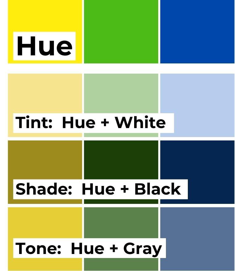
Colors in their original, pure hue are often too bright and bold for a therapy office. They’re fun and vibrant, but in their raw, unmixed state, I find that they bring too much energy into a therapy office.
A tint is made by adding white to a hue. It is a lighter version of the pure color and can sometimes look a bit pastel. A shade is made by adding black to a pure color. Shades are darker versions of the original hue. A tone is made by adding gray to a pure color. These variations add more depth and sophistication to colors.
Therapy Office Color Palette
So how do you apply this to your therapy office color palette? If you know you love green and want to add green to your space, consider using sea green, sage green, olive green, or dark green. Stay away from a bright kelly green, as this pure hue may feel too bright and energizing. For blues, go for light blue, blue-grays, indigo, or navy instead of cobalt.
Don’t forget to add black (or white)!
Adding small black accents to any room elevates the look of the space. I heard one designer compare adding black to a room to putting mascara on – it’s a final touch that helps anchor a space. Some ideas for where to add black: a side table (or the legs of a side table), picture frames, lamps, bookends. To make these accents look intentional, I recommend adding at least 2 small black accents in your office. If your office has black window frames, adding black into your decor, even in small ways, can help balance out the window frame and make the whole space feel more cohesive. If you do not like black, try this same trick with white.
Break the Rules
If you work with kids and teens or do art or other expressive therapies, you may decide you want to use pure hues to add a playful, energizing feel to the space. Or maybe you just love color and know you’ll feel better in a bright, cheery space. Go for it!
